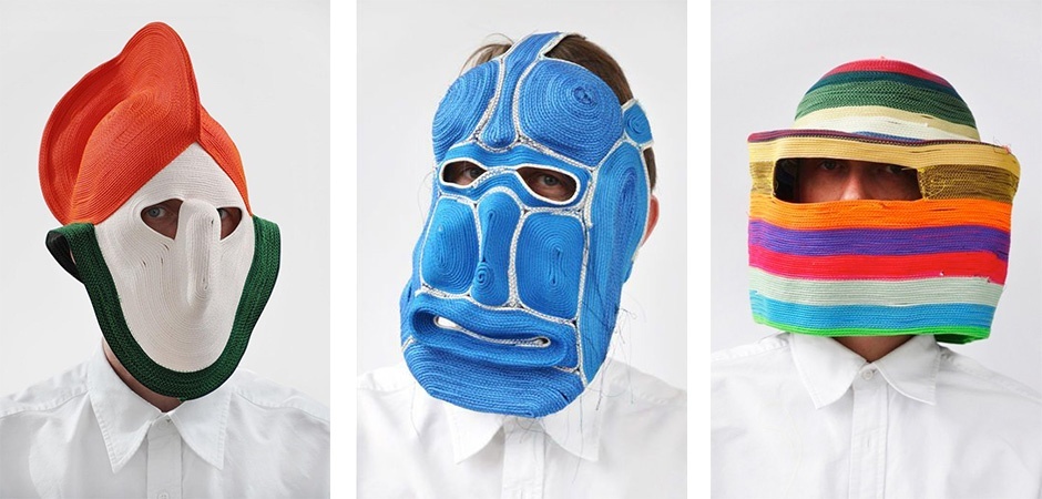
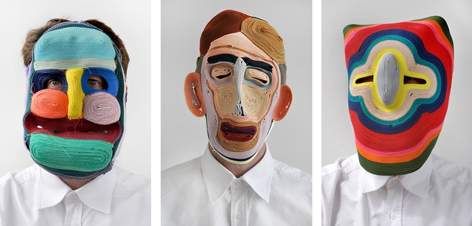
Each color is interpreted differently by our brains and therefore has a different emotional or psychological impact. The Color Cluster System, developed by Color Navigator, applies this science, when clustering colors according to style, type and culture.
THINKING IN TERMS OF COLOR PSYCHOLOGY
When thinking in terms of color psychology, science and emotion are inextricably connected with each other. As explained in previous blog posts, color affects the three stimuli centers of our brains. Colors with a high vibration frequency have a different effect from those with a low one. Although we are not always aware of it, colors evoke emotions and affect our state of mind. The emotional value and the effect of a particular color can vary from person to person. We all have favorite and less favorite colors. We associate colors with certain memories, symbols, objects, or even smells and places. This color memory is very personal, but also partly collective; think of national symbols or regional cultural practices. We will discuss the universal properties and meanings that apply to colors later on in this blog.
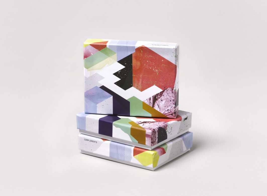
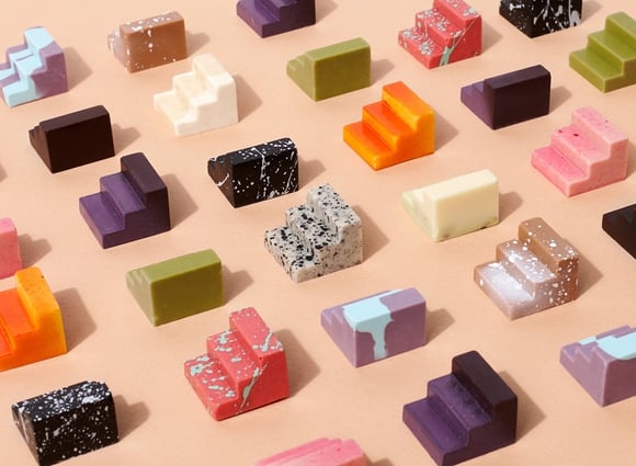
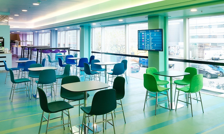
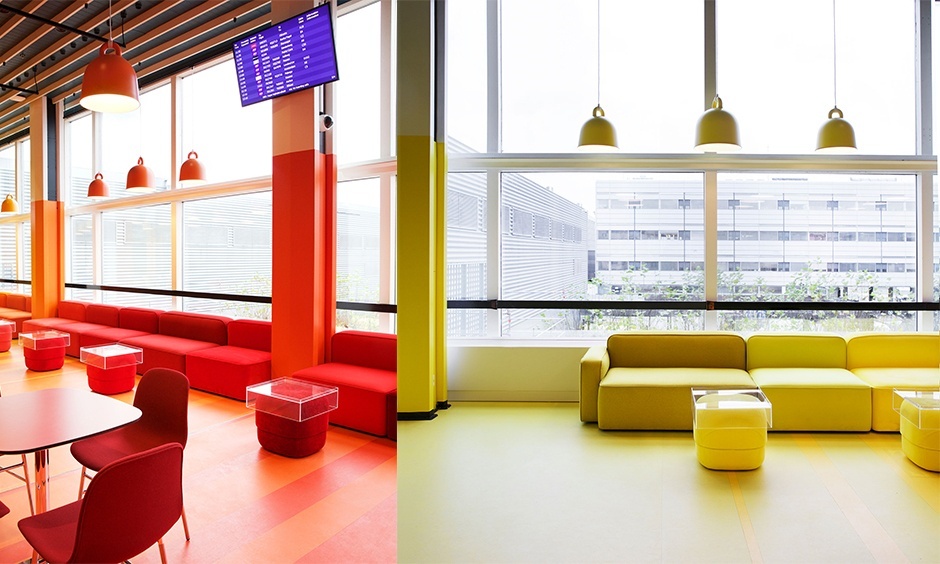
/Color%20psychology/In%2085%20of%20all%20buying%20decisions%20color%20is%20the%20dominant%20factor.png?width=200&name=In%2085%20of%20all%20buying%20decisions%20color%20is%20the%20dominant%20factor.png) Knowing that color can evoke certain emotions, convenient use is made of this to influence, for example, our buying behavior. Advertising is unthinkable without the appropriate use of color. But also in the design of offices, schools, hospitals, shops, cinemas and restaurants, color is used in a functional way to put us at ease, keep us alert or help us find our way. In many disciplines, such as product development, interior decoration, clothing, graphic design and advertising, color plays a crucial role. The correct application of color can make or break the launch of a new product or brand. The unconscious choice for a particular product is in fact largely determined by its color.
Knowing that color can evoke certain emotions, convenient use is made of this to influence, for example, our buying behavior. Advertising is unthinkable without the appropriate use of color. But also in the design of offices, schools, hospitals, shops, cinemas and restaurants, color is used in a functional way to put us at ease, keep us alert or help us find our way. In many disciplines, such as product development, interior decoration, clothing, graphic design and advertising, color plays a crucial role. The correct application of color can make or break the launch of a new product or brand. The unconscious choice for a particular product is in fact largely determined by its color.
The more knowledge we have about the function and meaning of color, the more we become aware of their emotional value. The art of combining colors to create pleasant harmonies can be learnt. Our color memory plays a major role in this.
DEVELOPING A COLOR MEMORY
/Color%20psychology/Color%20memory.png?width=300&name=Color%20memory.png) The more extensive our color memory, the richer our color experience. As a child, we learn to distinguish, recognize and remember colors. Learning to see colors starts when a child can consciously distinguish different colors. Around his second year, it starts to recognize, remember and - depending on his language development - appoint colors. By naming the colors of everyday objects, such as fruits and vegetables, the child learns to store colors in his memory. First the primary colors, red, green and blue, are discussed, because these are experienced as the most powerful by our brains. Then it learns the intermediate colors, such as orange and purple. It is important that not only the sight, but also the other senses are involved in this learning process. For example, our brains link the smell of a strawberry to its red color, which makes it easier to remember and evoke the smell and color.
The more extensive our color memory, the richer our color experience. As a child, we learn to distinguish, recognize and remember colors. Learning to see colors starts when a child can consciously distinguish different colors. Around his second year, it starts to recognize, remember and - depending on his language development - appoint colors. By naming the colors of everyday objects, such as fruits and vegetables, the child learns to store colors in his memory. First the primary colors, red, green and blue, are discussed, because these are experienced as the most powerful by our brains. Then it learns the intermediate colors, such as orange and purple. It is important that not only the sight, but also the other senses are involved in this learning process. For example, our brains link the smell of a strawberry to its red color, which makes it easier to remember and evoke the smell and color.
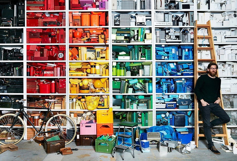
Colors are stored in our long-term memory, the memory for information that is permanently stored in the brain, but not always consciously experienced. This memory has a very large capacity. It is important to know how knowledge is stored here, to gain more insight into building a color memory.
When we learn something, our brain cells become active. The many small branches of the brain cells then make contact with each other. Scientists call that contact between the cells 'synapse'. When we learn something new, the synapses become stronger. Everything we see, hear, feel and experience is stored. The next time we experience the same, we can understand it more easily. If information in the short-term memory is repeated often enough (or saved long enough), it is transferred to our long-term memory. Information or knowledge stored in this way will be stored for a very long time.
Our color memory contains automatic and unconscious associations, because we see certain colors coming back and always experience the same way. For example, green is associated with immaturity. Think of green tomatoes or bananas.
Color is everywhere. As adults, we experience the presence of color as a matter of course and are not always consciously involved. When we see a new specific color at a certain moment, we will not immediately remember it. But by viewing this color with as many senses as possible, consciously experiencing, repeating and remembering, we can continue to expand and develop our color memory throughout our lives.
COMMUNICATION ABOUT COLOR
Our color memory is brought to bear when we communicate about color. If we talk about color, we use images and associations that are stored in our color memory. By referring to the color of universally known objects, such as flowers, plants and fruits, we can evoke a color image that is understandable to everyone. Take for example eggplant, mandarin, lime, lavender, poppy or olive. Certain brands, products and national symbols can also remind us of a specific color. Think of Ferrari red or Barbie pink.
Because the designation of color is regionally associated and is subject to fashion, it is impossible to use a complete list of color names. Below we give some examples of universal colors.
/Color%20psychology/Universal%20colors.png?width=1104&name=Universal%20colors.png)
THE MEANING OF COLOR
Why do we associate red with love, blue with cold and green with nature? The reasons behind this are sometimes historically, politically or culturally determined, often also by way of physics or biology.
Colors have different meanings in different cultures. In the Western world, black is the color of mourning, whereas in China this function is filled in by white, in West-India by orange. In the field of politics, colors also have a special symbolism. Eighty percent of all flags contain the color red which symbolizes power, blood, life. Red is the color of strength, energy and dynamism. The color of the United Nations is blue, which symbolizes non-aggression, universality and calm.
Creative, unconventional use of color can yield interesting results. But there are also universal conventions of functionality. So it is not wise to reverse universal colors for hot and cold on a water tap or to change something about the generally accepted color composition of a traffic light. Next, we present a brief summary of the universal meaning, symbolism and emotions associated with the main colors, black and white. This is intended as an extra guideline for those who, when making color choices, also want to take account of the functional or psychological aspects of color.
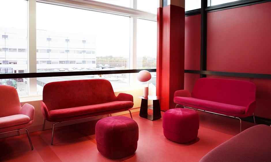
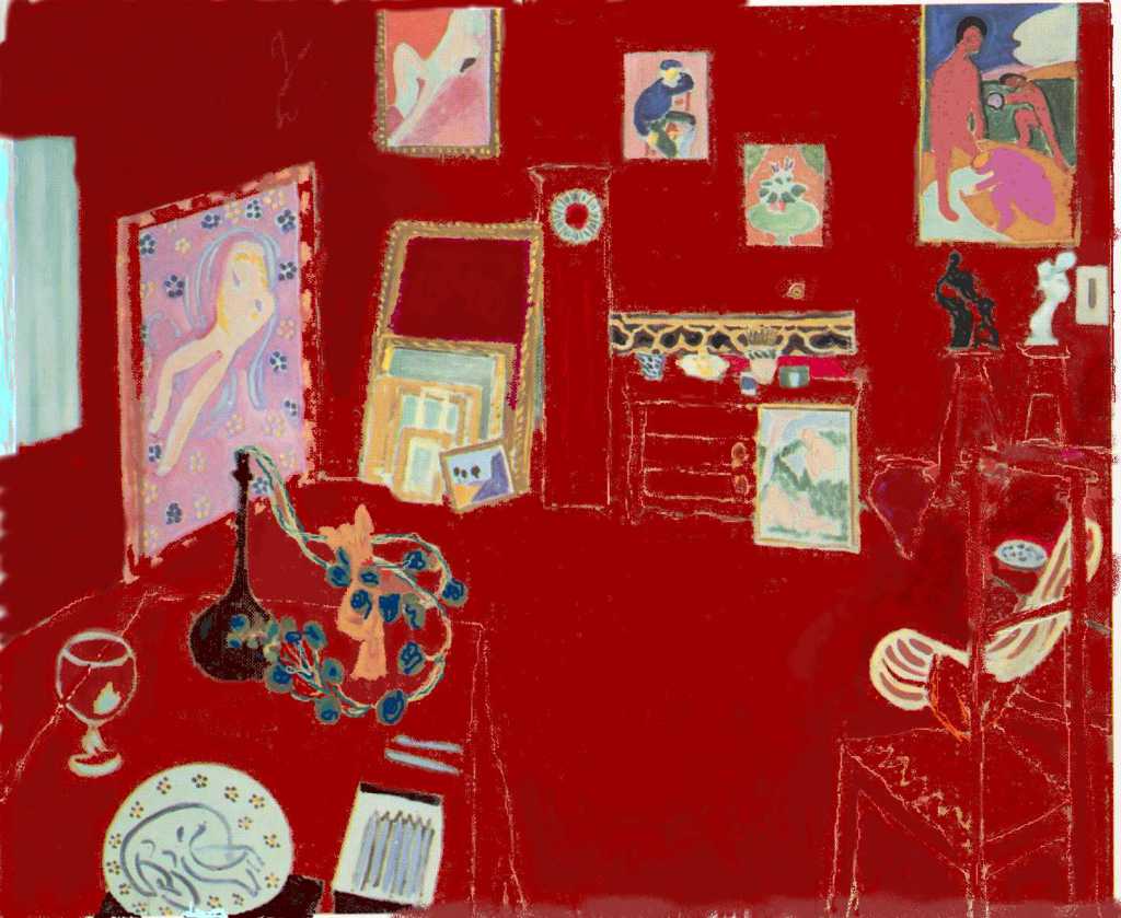
Red
Energetic - striking - warm - strong - dangerous - rich
/Color%20psychology/Red.png?width=500&name=Red.png) Red is the first color named by a person. In some countries the word for red also means ‘color’, for example 'colorado' in Spanish.
Red is the first color named by a person. In some countries the word for red also means ‘color’, for example 'colorado' in Spanish.
Symbolically: Red symbolizes fire, blood and life force. It is the color of passion, love and lust but also aggressiveness and power. Red is pre-eminently the color for flags because it symbolizes struggle, life and revolution.
Historically: In the time of the Romans, a custom existed of drinking the blood of dying opponents because it was said to give strength. Amongst the Greeks, blood was poured into the graves of the deceased in order to give them power in the afterlife. Later, medicines were made with a red color, band-aids and bandages were red, children wore a red ribbon to protect them from all kinds of diseases.
Red is also viewed historically as the color of nobility and represents wealth because red dye for clothes used to be difficult (and therefore also expensive) to manufacture. In the Middle Ages wearing red was a right reserved to the nobility. Anyone who wore red and was not of the nobility, was put to death.
Culturally: In areas where the heat of the sun threatens life, the warm color red is the color of the demonic. Conversely, in cold countries, red has a positive meaning, because it is associated with heat. In factories they used to paint the walls red to eliminate complaints about the cold.
Psychologically: The color of dynamism and advertising. Red generates energy and is therefore widely used by the food industry: breakfast cereals are usually packed in boxes with red-orange-yellow as the predominant colors; there is no better way to start the day cheerfully and full of energy.
Functionally: The color of danger and prohibition, think of traffic signs and warning signals. As it happens, red is one of the most striking colors, both during the day and at night.
Surroundings: Red is a warm color and will come to you, as it were; objects appear bigger than they actually are. A room decorated in red that faces north will appear darker.
Fashion: A person who wears red gets noticed; red has a high attention value, is associated with excitement, strength, power, action, energy, warmth, assertiveness, presence.
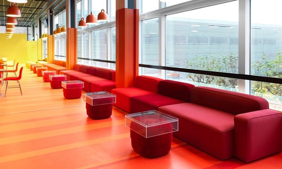
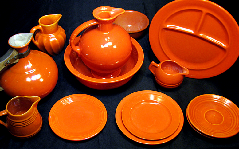
Orange
Optimistic - cheerful - energetic - harmonious - open
/Color%20psychology/Orange.png?width=500&name=Orange.png) Orange is a mixture of red and yellow, and thus holds the middle ground between these two colors, it represents balance and harmony, makes things cheerful and promotes affection, tranquility and balance. Orange comes on softer than red. It relaxes and dissolves fears and blockages.
Orange is a mixture of red and yellow, and thus holds the middle ground between these two colors, it represents balance and harmony, makes things cheerful and promotes affection, tranquility and balance. Orange comes on softer than red. It relaxes and dissolves fears and blockages.
Symbolically: Orange symbolizes high spirits and optimism, hope and well-being, the harmonious combination of feeling and intellect.
Culturally: Because orange stands for emotional balance, it is used to express religious feelings or insights. Buddhist monks therefore wear orange robes.
Psychologically: Orange is an active and vibrant color. It stands for joviality, playfulness and adventure. Orange is festive, inspiring, tasty, interesting, active, warm and stimulating. It is a color that encourages pleasure in social contacts. Orange has a positive effect on depression, melancholy, anxiety, discontent and pessimism. Orange works primarily on the senses, stimulates the appetite and often has a healing effect.
Functionally: Orange, just like red, is a warning color; think of its use in traffic, for example, an orange traffic light.
Surroundings: Orange provides warmth and is stimulating. Orange provides a combination of heat and light with which a pleasant atmosphere is created.
Fashion: In fashion, orange stands for warm, cheerful, youthful, extreme, happy, open and capricious.
Yellow
Sunny - striking - illuminated - valuable - warning
/Color%20psychology/Yellow.png?width=500&name=Yellow.png) Yellow is related to white, and is the lightest color. The color of the sun, even though sunlight is actually colorless.
Yellow is related to white, and is the lightest color. The color of the sun, even though sunlight is actually colorless.
Symbolically: Yellow is the color of optimism, of light and insight, and of acid (lemons). Yellow is also used as gold when the beautiful, the valuable is meant.
Historically: Yellow is the color of the sun gods Helios, Apollo and Sol. Previously yellow also represented danger. So a yellow flag on a ship meant that it was subject to an epidemic. A yellow flag in a medieval town meant plague.
Culturally: Yellow stands for illumination and insight. In Islam, golden yellow is the symbolic color of wisdom. In Asia, yellow is the color of happiness, fame, wisdom, harmony and the highest civilization. In China, yellow is therefore a masculine color, with black as feminine counterpart. In Europe, the reverse is true: yellow is more of a feminine color and black is masculine.
Psychologically: Yellow is striking, pushy and loud. The word yellow is related to “screaming”, the gutter press is called “yellow press” . Yellow is also a color that is associated with cheap.
Functionally: Black letters on a yellow background are the most legible from a distance. That’s why yellow is the international signaling color. The symbols for toxic, flammable, explosive and radioactive materials are black on yellow. Black-yellow lines mark boundaries that may not be exceeded and warn of protrusions.
Surroundings: Too much yellow causes restlessness but gives a warm look because yellow reflects light well. A room decorated in yellow comes across as friendly; in combination with orange, the cozy atmosphere is enhanced.
Fashion: Yellow for clothing is fresh, innovative, original, intelligent and lively.
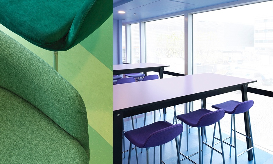
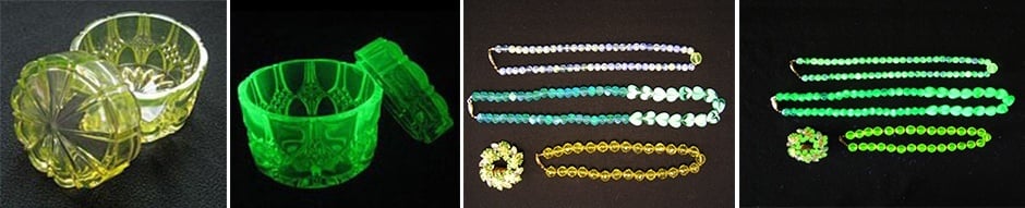
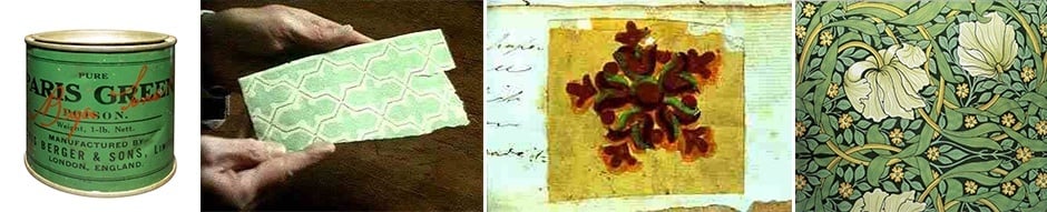
Green
Young - healthy - fresh - natural - stable
/Color%20psychology/Green.png?width=500&name=Green.png) Some people can appreciate green and others not at all. This is probably due to the fact that the spectrum of choice for typical green is very large and green looks really different at night from the way it looks during the day.
Some people can appreciate green and others not at all. This is probably due to the fact that the spectrum of choice for typical green is very large and green looks really different at night from the way it looks during the day.
Symbolically: Green is the color of youth, the color of life and new life, spring.
Historically: Green is a holy color in Islam. Originally Islam was espoused by many desert peoples. In the desert, green is the color of paradise and represents fertility, life.
Culturally: Green is the universal color of hope because one looks forward to spring.
Psychologically: Green reminds us of nature. Color of fresh, sour, bitter. The experience that green things are fresh is not universal but strongly dependent on the material.
Functionally: Green is widely used as approval, think of green light (literally and figuratively).
Surroundings: Green is restful and increases focus. Various shades of green give a natural effect. Green is neutral and is mainly relaxing.
Fashion: Green represents wealth, prosperity, environmental friendliness.
Blue
Cool - calm - intelligent - professional - loyal
/Color%20psychology/Blue.png?width=500&name=Blue.png) In a composition, blue is the color that appears the most distant, while red seems to be the closest. Every color actually looks more bluish when it is further away because it is covered by layers of air. We also see water and air as blue even though they are actually transparent.
In a composition, blue is the color that appears the most distant, while red seems to be the closest. Every color actually looks more bluish when it is further away because it is covered by layers of air. We also see water and air as blue even though they are actually transparent.
Symbolically: Blue is the most popular color because it has many good features. Blue stands for sympathy, harmony, kindness, intelligence, loyalty and sincerity. It stands for utopian ideas whose realization lies in the future, in the distance.
Historically: For a long time, blue was the only color for clothing, especially for the common man. Blue was nondescript, suitable for everyone and every occasion. Moreover, dyeing clothing blue or indigo was fairly easy and inexpensive.
Culturally: The expression “to have blue blood” is universal. Members of the nobility often avoided the sun to protect their white skin. When a person’s skin is white, the blue veins shine through, which led people to think that they were filled with blue blood. In the Catholic faith, it is also the color of the divine, the color of Mary. For this reason, school uniforms are also usually blue.
Psychologically: Blue is a cool, cold color. This is based on experiences that, for example, shadows, ice and snow have a blue hue. Our skin turns blue when it is cold. Blue is also seen here as the opposite of red. Inter alia, red is the color of the bodily, the erotic and the non-spiritual. And blue of coolness, the power of comprehension, the intellect, science, accuracy.
Functionally: Cold blue versus red hot is used to distinguish cold and hot water at a faucet. Research indicates that the use of color in lighting (blue for example) can slow our heartbeat and relax muscles, while other colors do exactly the opposite.
Surroundings: A blue room exudes restfulness and is experienced as cool. It is experienced as a silent, aloof color.
Fashion: Wearing navy blue stands for conservative, authoritative, businesslike, loyal, trustworthy. (Dark) blue can almost always be worn, it is a very safe color.
Purple
Mysterious - spiritual - sensual - ripe - holy
/Color%20psychology/Purple.png?width=500&name=Purple.png) Purple and lilac rarely occur in nature. As a result, the names of these colors in most languages are identical to the names of the few flowers that are purple or lilac.
Purple and lilac rarely occur in nature. As a result, the names of these colors in most languages are identical to the names of the few flowers that are purple or lilac.
Symbolically: Purple stands for the magical, the mysterious and secretive, the immoral, the spiritual, but is also the color of decadence and power.
Historically: It was probably the Phoenicians who, around 1500 BC, discovered the secret of purple dye. Purple is made from marine snails and is very cumbersome and expensive to produce. In Catholic doctrine, purple was already mentioned as the most costly color in the Old and New Testament. The privilege of being allowed to wear purple was, in ancient times, more important than being allowed to wear gold.
Culturally: The only public institution that dresses its attendants in purple is the Catholic Church. Purple here has three meanings: it is the color of the bishops, the color of worldly power, of eternity and justice. Purple, as a liturgical color, is also the color of atonement and Lent. In Christian symbolism, it is also the color of humility.
Psychologically: Purple stands for the extravagant. All mixed colors containing purple are ambiguous and non-businesslike. Purple is the most mysterious and elusive of them. The uncertainty of whether a purple hue is reddish or bluish, is never dispelled. In a different light, purple can appear to be completely different.
Functionally: Purple is a popular color in advertising. For cheap products with a low life expectancy and for fashionable accessories, designers like to seize on purple.
Surroundings: Purple is a combination of warmth and coolness, it is pre-eminently a color that is inspiring.
Fashion: Purple as a fashion color is quiet, thoughtful, peaceful, spiritual, dignified, somber. Daring and not too sweet.
Pink
Sweet - romantic- feminine - soft - charming
/Color%20psychology/Pink.png?width=500&name=Pink.png) Rose or pink is a color name that is used for both a light red color (so red with a high intensity) and for light (intense) and saturated magenta. Rose is derived from the French word for a rose, the flower.
Rose or pink is a color name that is used for both a light red color (so red with a high intensity) and for light (intense) and saturated magenta. Rose is derived from the French word for a rose, the flower.
Symbolically: Rose, because of its association with the color of the rose, is traditionally seen as an optimistic, cheerful and positive color. You come across it in all languages, for example, in the expression a rosy future. Often this is accompanied by a connotation of being unrealistic, as in “seeing everything through rose-colored glasses” and also “no roses without thorns.” Rose (pink) is also used as a symbol for homosexuality.
Historically: Red, according to our Western color symbolism, is the masculine color, pink (rose) is the little red, so has long been the color for young boys. Blue is the color of Mary and light blue, according to an ancient tradition, is the color for little girls. Around the 1920s, owing to the alienation of this religious symbolism, blue ceased to be regarded as the color of Mary and came to be regarded as the color of naval uniforms. Also in industry, almost all workers now wore indigo blue. Then the symbolism switched and blue became the color for boys, while for girls, pale pink took over from the traditional contrasting color of light blue, being considered sweeter and more sensitive than the cool light blue.
Culturally: In fashion for adults, the colors for male and female clothing have converged. Especially with the advent of the typical blue jeans, there is little difference between male and female clothing, and as far as fashion is concerned, there is also increasingly less between clothing for adults and children. The gender-linked colors are still just a habit from a distant past.
Psychologically: Pink is associated with the feminine, the romantic, the soft and sweet, the charming and polite. Normally these properties are combined with things that are like that.
Surroundings: Pink stands for a romantic and soft appearance. If it is a stronger pink, it becomes a more passionate color. In interior decoration, pink is an interesting accent color. Pink is associated with the feminine, but on the other hand, it also stands for a striking and bold attitude.
Fashion: In fashion wearing pink gives a feminine, delicate, compassionate and calm feeling.
Brown
Earthy - stable - simple - neutral - comforting
/Color%20psychology/Brown.png?width=500&name=Brown.png) Brown is an earthy color that has a lot of nuances. The color is a mix of the primary colors yellow, red and blue. As a result, it has points of contact with all other colors.
Brown is an earthy color that has a lot of nuances. The color is a mix of the primary colors yellow, red and blue. As a result, it has points of contact with all other colors.
Symbolically: Brown stands for earthy, completeness, stability and restfulness, warmth and security, honest, simple, modest and noble. Brown can promote appetite, has a healing effect and symbolizes simplicity, kindness and reliability.
Culturally: In the Catholic religion, brown is the color for the vow of poverty which was taken by brothers and fathers in abbeys. As a result, the color acquires a humble character and a deep respect.
Psychologically: Brown is wise and fosters patience out of a sense of continuity; life goes on. Brown gives a feeling of space and growth. It is a calming and relaxing color that breaks down barriers. Brown provides comfort and the feeling of being wrapped up in motherly love and protection.
Functionally: Brown is a practical color because it does not get dirty easily and is also a cheaper color, which is obtained by mixing multiple colors together.
Surroundings: Brown is the color of comfort and elegance. A brown space must have sufficient incident light, or it becomes a boring color. Brown rooms look smaller but cozier.
Fashion: Of course, warm, humble, friendly, earthy, approachable. Brown is a great color to use if you want to stay more in the background. Also beige is a neutral background color, exudes trust, goodness, purity and innocence.
White
Clean - light - innocent - pure - positive
/Color%20psychology/White.png?width=500&name=White.png) White is the sum of all colors of light. White is the most perfect of all colors. There is almost no context in which white has a negative meaning.
White is the sum of all colors of light. White is the most perfect of all colors. There is almost no context in which white has a negative meaning.
Symbolically: White is the color of the divine, the perfect, the ideal, the good and innocent. All good things come together in the symbolism of the white. All of the negative is eliminated. White, together with its polar counterpart black, stands for the struggle of good against evil, of day against night.
Historically: Throughout the centuries, white has been a color with status. Because clean clothing was a luxury, white was a status symbol. Workers wore blue or grey shirts. And a white shirt was the standard color of anyone who did not have to get dirty when working. Only in the seventies did colored men’s shirts become acceptable even for bank clerks.
Culturally: White is the color of simplicity, purity and modesty. Because of this meaning, white became a color of mourning. White mourning clothes belong primarily to the religious idea of reincarnation, for example in Asia. But also in Europe. within the Catholic Church, white was used as a color of mourning. At funerals, women would wear large white shawls around their heads and upper bodies.
In India, a white cow is considered the embodiment of light. In China, the heron and the ibis are sacred birds, they symbolize immortality. Priests from Indian and Japanese religious communities go about dressed all in white. In the Catholic mass, the priests wear a white tunic. White is the liturgical color of the main Catholic holidays.
Psychologically: Outer beauty and inner purity are associated with white. One of the few contexts in which the color white evokes negative associations is that of sterility and hospitals.
Functionally: Instinctively, white stands for everything that must be hygienic and clean. In places where foodstuffs are processed, white clothing is prescribed (for example bakers, chefs, butchers). But also in healthcare, white is customary attire and hospital furniture is often painted white. Cleaning products often traditionally have white or white-blue packaging because these add strength to the effect of the product.
Surroundings: White provides an optimal reflection of the light and makes the room seem larger. When used unilaterally, it becomes aloof and cool. It is thus preferable always to mix it with a warm color. White reflects light and provides space and restfulness.
Fashion: White as a fashion color is pure, innocent, hope, forgiveness, trust and cleanliness.
Black
Stylish - distant - dramatic - modern - negative
/Color%20psychology/Black.png?width=500&name=Black.png) Black is stylish and devoid of risk.
Black is stylish and devoid of risk.
Symbolically: Black symbolizes individuality and aloofness and is associated with class and style. Black is also the color of conservatism and anarchism. Black also has the meaning of commonality, misfortune and death. ‘Blacken someone’, a ‘black day’, black animals usually do not predict anything good.
Historically: It used to be alleged that someone who was somber or melancholic, had black blood. It is still the case that all negative feelings are associated with black. A person who “sees everything as black” or is in a black mood, is a pessimist. One also speaks of “black humor”. The end of all living things is black and that makes it a color of mourning.
Culturally: Black is often the color of the clothing of clergy. It is the color of authority and severity. In many cultures in the world, black is experienced as negative.
Psychologically: Color of negative feelings, of filth and meanness.
Functionally: Black is the color for stereo installations, cameras and watches, which should come across as very modern technical products. Because colors are dispensed with, the appeal is to professionalism and functionality.
Surroundings: Black in an interior testifies to luxury, gloominess and mystery. Black absorbs the light and its use should not be exaggerated. Black is good to use as an accent color, but used in excess, it makes the space smaller.
Fashion: With black clothes you imperceptibly create a distance from others. Wherever team spirit and social skills are important, this color is less suitable.
Grey
Stylish - subtle - soothing - timeless - neutral
/Color%20psychology/Grey.png?width=500&name=Grey.png) Grey does not evoke any emotions and can therefore easily be combined with other colors. Grey is a timeless color. Grey is almost never mentioned as a favorite color.
Grey does not evoke any emotions and can therefore easily be combined with other colors. Grey is a timeless color. Grey is almost never mentioned as a favorite color.
Symbolically: Elegance, humility, stability, subtlety, wisdom, old age, anachronism, dullness, dust, pollution, formality. In Europe and America, grey is the color most associated with boredom, loneliness and emptiness. It is associated with rainy days and winter. Silver symbolizes rest.
Historically: In antiquity and the Middle Ages, grey was the color of undyed wool, and so it was the color most worn by peasants and the poor. In the 18th century, grey became a major fashion color, both for women’s dresses and men’s jackets and coats. Around 1930, grey became a symbol of industrialization and the war. Grey concrete became a popular building material for monumental works of modern architecture in the late 20th century. The 1950s and 1960s were the era of glory for the grey suit; these were worn by film stars such as Cary Grant and Humphrey Bogart, and by President John F. Kennedy, who wore a two-button grey suit. At the beginning of the 21st century, grey again came to be regarded as monotonous and without character.
Culturally: In the Christian religion, grey is the color of ash, and thus a Biblical symbol of mourning and remorse. Grey is the color most associated in many cultures with the elderly and old age; because of its association with grey hair, it symbolizes the wisdom and dignity that come with age and experience.
Psychologically: Safety, reliability, intelligence, moderate, modesty, dignity, maturity, solid, conservative, practical, old age, sadness, boring. Grey is also the color most associated with uncertainty, a “grey area” is an issue about which where there is ambiguity in law or policy.
Functionally: Grey consists of white and black. Therefore, this color is always looking for the right balance, the color of the still unconscious and undefined. Grey evokes no emotions in its own right, but can be combined well with other colors. Grey is adjacent to silver and brings calmness and serenity. A cool elegance emanates from this color.
Fashion: Always combine grey with another color. Grey is good for a conservative look and also stands for calm, dignified and formal.
THE INFLUENCE OF COLOR IN SHAPE
Anyone combining color with shape must take into account the character and emotional values of color; these are capable of affecting the shape in an entirely unique way. Sometimes, through the correct color choice, even a shape which is not ideal can be corrected.
The influence of color on shapes can be used to perfect a design. Dark, matte colors have a shape-concealing effect. This effect is strongest with matte black. Shape accentuating colors are all the bright and shiny ones, the effect being strongest with semi-gloss white. Warm colors play an active role with respect to the shape and have a major impact. Cold colors behave passively with respect to the shape and, in the first instance, allow the shape to determine the entire character.
/Color%20psychology/Red%20yellow%20green%20blue%20purple.png?width=1980&name=Red%20yellow%20green%20blue%20purple.png)
Red
Red behaves actively, strengthens the shape and gives it an almost aggressive character; soft shapes cannot tolerate red. Dark red makes the shape solid and respectable.
Yellow
Yellow causes the shape and structure of the object to disappear behind the color. The consistency of shape and color is present to a lesser extent on a smooth surface than on a rough surface. Shiny yellow encloses the shape and makes the borders vague. Gold has an effect similar to that of yellow, but is warmer and more active. It adds depth and makes the shape flexible.
Green
Green unites with the shape and has not the least impact on it, unless the area becomes too large, in which case green becomes a somewhat difficult color; applied normally, it makes the shape fresh and restful.
Blue
Blue allows shape and surface structure to fully come into their own and make them active; with a rough surface in that color, the characteristics are strongest, and likewise with matte blue. Light blue is expressive of shape, behaves passively and allows shape and structure to work for themselves.
Purple
Purple influences the shape in different ways, depending on the application. Since purple is a subtle color, it can take on many shapes, depending on how the light falls.
/Color%20psychology/White%20black%20grey.png?width=1980&name=White%20black%20grey.png)
White
White has a liberating effect on the shape and allows it to speak for itself. Silver, in a glossy finish, has about the same effect as white, albeit somewhat less; in matte finish, on the other hand, it makes the shape hard and cool.
Black
Black, in matte finish, has little influence and at most gives weight to the shape.
Grey
Grey deprives the shape of part of its value.
CONCLUSION
/Color%20psychology/Two%20thirds%20of%20everything%20we%20process%20and%20remember%20is%20visual.png?width=200&name=Two%20thirds%20of%20everything%20we%20process%20and%20remember%20is%20visual.png) Color has an enormous impact on humans. Two thirds of everything we process and remember is visual: light and shapes. They have a permanent effect on our daily lives, our state of mind, performance, hormonal state, metabolism and so much more. And still, color is one of the most neglected and underappreciated aspects in design and development, as well as in most creative education programs in the world.
Color has an enormous impact on humans. Two thirds of everything we process and remember is visual: light and shapes. They have a permanent effect on our daily lives, our state of mind, performance, hormonal state, metabolism and so much more. And still, color is one of the most neglected and underappreciated aspects in design and development, as well as in most creative education programs in the world.
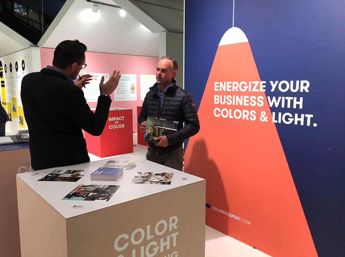
As we saw earlier, color also influences our purchasing decisions. Any communication or advertisement of your brand, product range or project uses color in a certain way. Our brain will subconsciously pick up your message based on the visual components. The question is: is the right message conveyed? All our expertise is used to choose the right colors and apply them to your designs, brands, packaging and advertisements that sell.
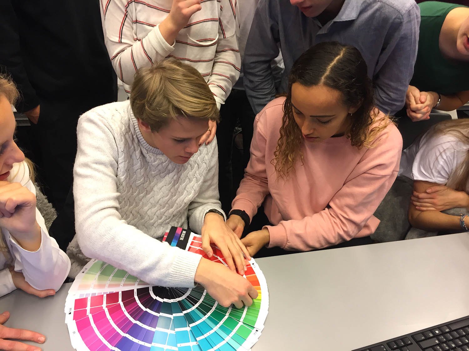
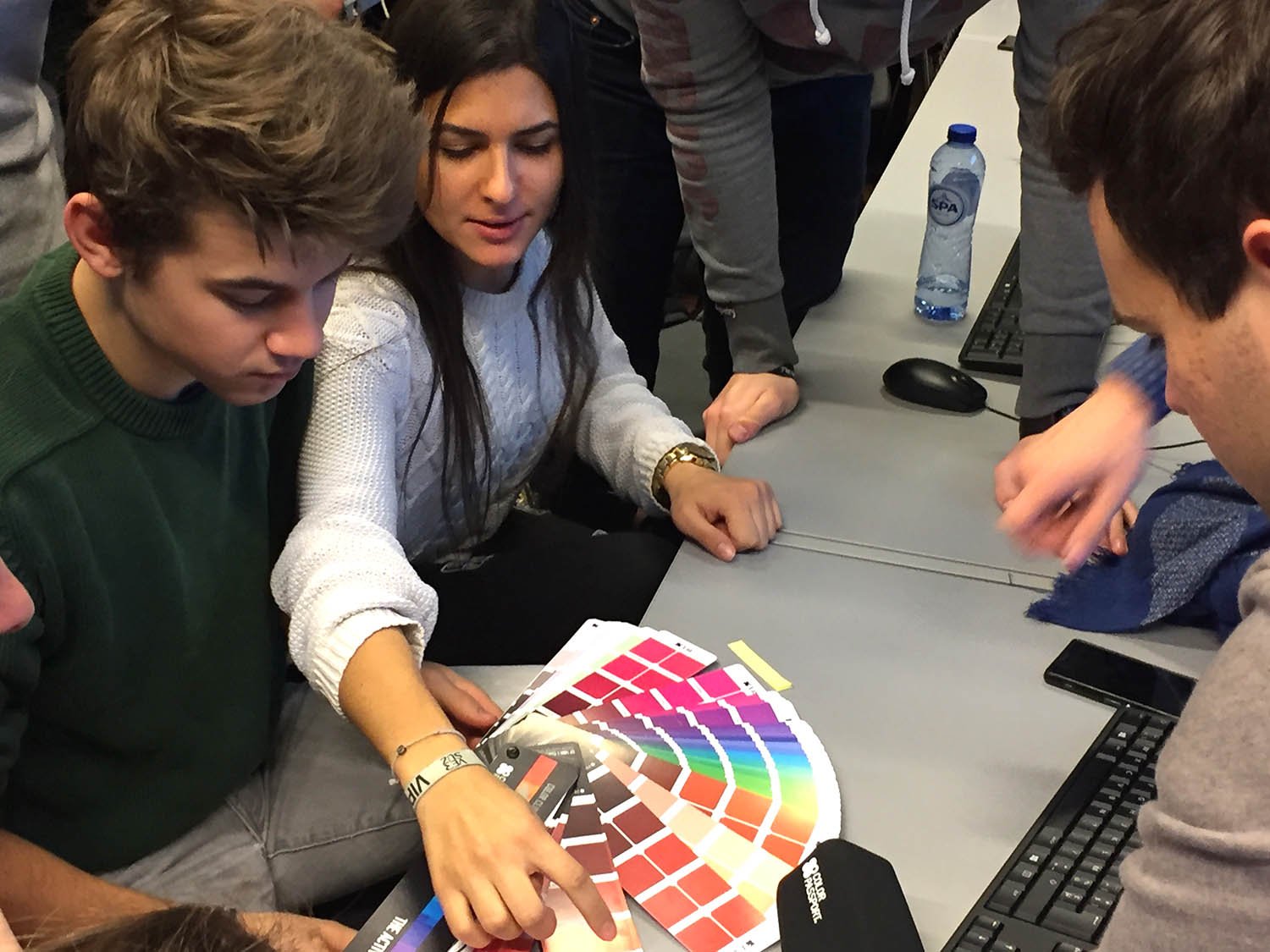
Curious about what color can mean for your product, brand or business?


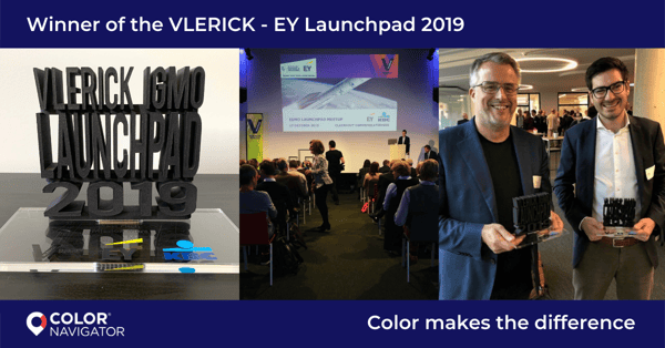


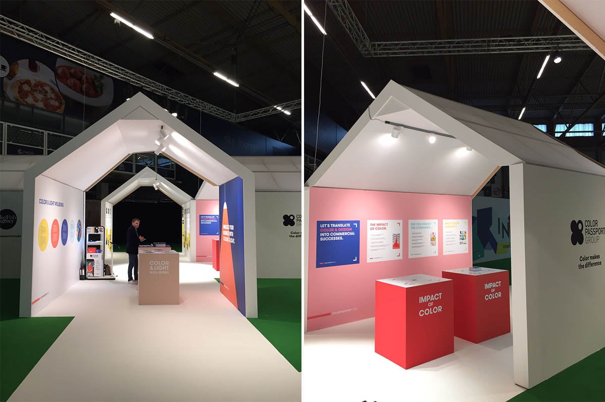

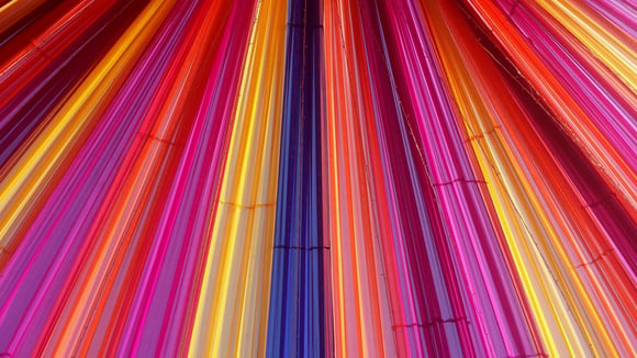


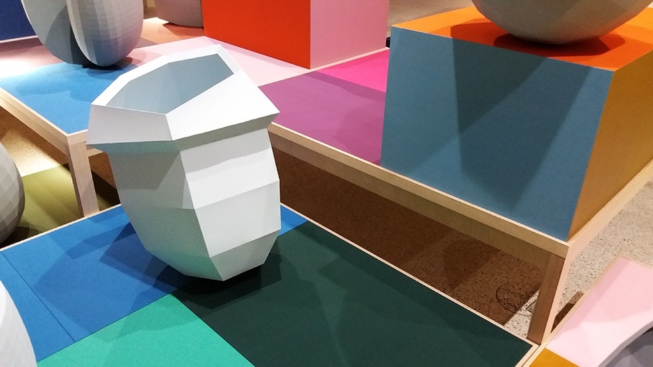
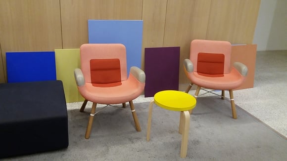
/Color%20Navigator%20workshop/Color%20Navigator%20workshop_01.jpg?width=1500&name=Color%20Navigator%20workshop_01.jpg)
/Color%20Navigator%20workshop/Color%20Navigator%20workshop_02.jpg?width=1500&name=Color%20Navigator%20workshop_02.jpg)
/Color%20Navigator%20workshop/Color%20Navigator%20workshop_03.jpg?width=1500&name=Color%20Navigator%20workshop_03.jpg)
/Color%20Navigator%20workshop/Color%20Navigator%20workshop_04.jpg?width=1500&name=Color%20Navigator%20workshop_04.jpg)


/Measuring%20color/Spectrophotometer.png?width=1921&name=Spectrophotometer.png)
/Measuring%20color/Colorimeter.png?width=1921&name=Colorimeter.png)

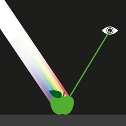

/What%20is%20color/Describing%20color/5.%20describing%20color%2001-2-1.png?width=250&name=5.%20describing%20color%2001-2-1.png) Hue stands for color tone and represents the location of a color on the color wheel. One speaks of the hue- or color angle, which is expressed in degrees.
Hue stands for color tone and represents the location of a color on the color wheel. One speaks of the hue- or color angle, which is expressed in degrees. 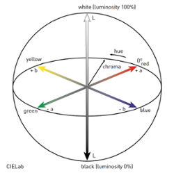

.png?width=1000&height=1000&name=Ontwerp%20zonder%20titel%20(34).png)
