Did you know that the color of our surroundings is the first thing that pops into our eye? Not the shape or material of an object, but its color is the first visual component registered by our brain. Unlike other mammals, humans are programmed to register color immediately. The origin of this process lies in our evolutionary needs. As nomads, we had to be able to make fire and distinguish the ripe from the rotten berries. Reading the landscape was a necessary skill for survival.
THE INFLUENCE OF COLOR
Now that we no longer have to seek our meals, color has been given a different function. Although the color of our environment is no longer a matter of life or death, it still plays a major role in our daily lives. Various studies have already been conducted to demonstrate the influence of color on consumers. In previous blog posts we have explained how color is perceived and the mood color provokes. What do consumers expect when they see the color of a packaging? What grabs their attention? What will gain their trust? What drives them to buy? Theoretically, the impact of color can only be explained in a single graph.
Warm vs. cool colors
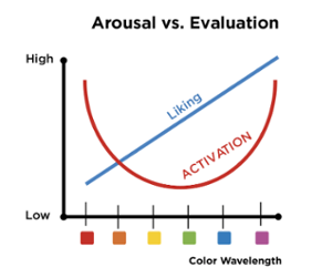
The graph demonstrates that warm colors, such as red, orange and yellow, activate you more than the cool colors, such as green, blue and purple. The latter are more calming and rational, while the former create more spontaneous reactions. Activation is at its peak with red shades, decreases with cool colors and rises again when evolving towards magenta, as the color circle comes back to red. As far as the color preference is concerned, we notice that blue and indigo shades score best. Warm colors are less popular.
Energetic vs. discrete colors
In addition to the 'temperature' of a color, its intensity can greatly impact its effect. Each color has its own level of chroma and greying. The higher the chroma and the lower the greying, the greater the impact of the color. Thus the energetic and fully chromatic colors appear stronger than discrete pastels or greyed colors.
With this knowledge in mind, you can match the color of your product, brand or company to your desired goal. In reality, however, many more factors are relevant. You have to take into account the age and gender of your consumer, as well as the setting and sector in which you are active. Finally, the geographical area in which you sell your product also plays an important role. The Color Navigator System, which has mapped more than 10,000 colors according to style, type and culture, is able to select the perfect color for your product, brand or company and thus dramatically increase the success of your product range.
THE COMBINATION OF COLORS
Color combinations allow you to create depth and movement. Although you can play it safe with a harmonious color palette, you can make a conscious statement with daring combinations. Finding the right look for your product, brand or company is often based on gut feeling, but can now be supported by the Color Navigator System, which offers a scientific explanation for all your color decisions.